You might think I’m a psychopath by the range of books I read (don’t worry, I’m not). One day it could be a book on parenting and then the next a book on the how the brain works.
So it would come as no surprise that I once picked up a book on Handwriting Analysis. While interesting, the book read more like a textbook and wasn’t entirely engaging. HOWEVER, there were definitely some takeaways that I learned which can help your campaign.
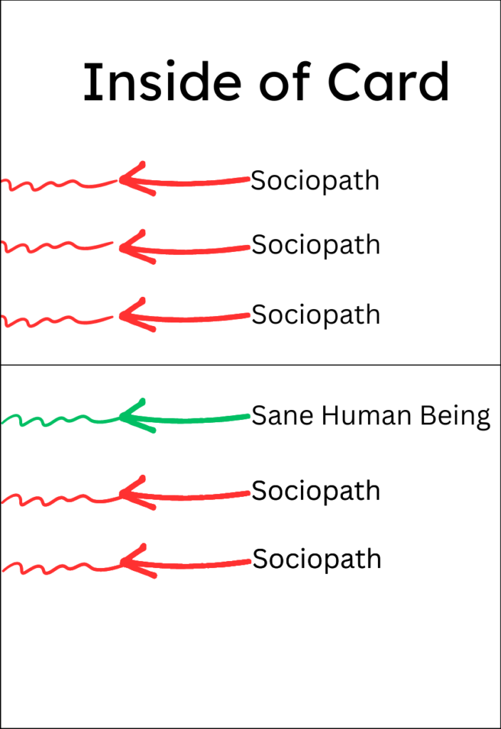
Sociopaths Often Write Erratically
If I recall, one of the handwriting styles they analyzed came from a mentally unstable and deranged person. Time and time again it showed that people who were a bit unhinged wrote non-uniformly with their handwriting mimicking their current state of mind.
Thankfully for you, our robot handwriting machines write legibly and consistently so you can thwart those sociopath vibes.
Different Fonts For Different Demographics
Depending on your campaign target audience, we can choose handwriting styles that will most appeal based on gender, age, and more.
For instance, if it’s a male audience older than 40 we would ensure that we’re using a larger font and communicating with brevity.
Or if we’re targeting both genders between the ages of 20-40 we would probably choose the most legible font and avoid anything with cursive.
Its simple changes like this that will touch on the subconscious psyche.
Length and Placement of Messaging
Understanding the intended goal of the campaign and the audience will also help determine the length of the message. Oftentimes people think “If I have the space on the card, I should use it all” but in real, thoughtful handwritten notes that’s not how it works.
It’s specifically important to try to get the entire message “beneath the fold” since that’s how most people write cards and where you start your writing will affect the appearance. See here:

The goal of each handwritten letter should be to get people to take action and not necessarily make a decision right there and then. So this eliminates extra words because you’re not trying to land the sale off a card- you simply want them to take the next. This could mean:
- Making a Call
- Visiting a Website/URL
- Setting Up an Appointment
- Referring a Friend
When we consider people read top to bottom and left to right, by strategically placing a call-to-action at the bottom right corner would likely mean that’s the last thing they read.
Lastly, when we consider the length and characters of each letter we want to walk the fine line between too little and too much. As with a human handwritten card, you don’t write maybe more than 3-5 sentences so we want to mimic that experience here as well.
Summary
When choosing the right handwriting and data segmentation, it’s important to start with the goal of each campaign and work your way through a data list.
While client groupings are imperfect and work under some assumed stereotypes, it’s still a stronger approach than using the same approach to a broad audience.

